Key takeaways
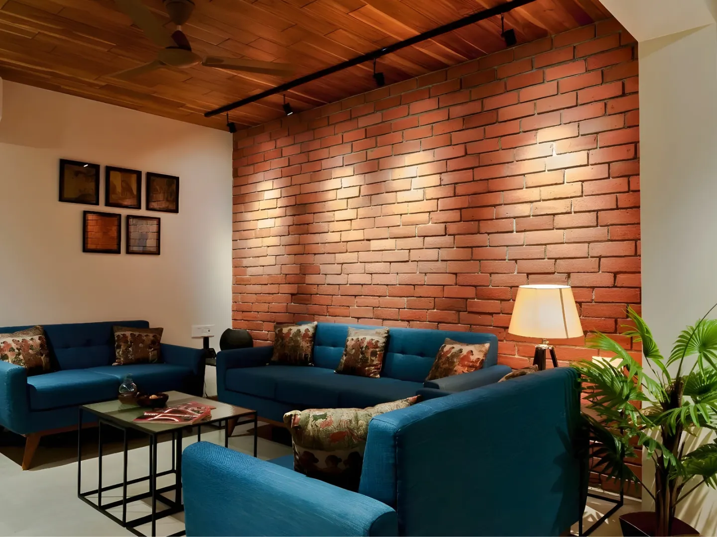
- One dominant texture with one subordinate beats an even split between three.
- Change texture where the room changes — a plane, a structural line, a full wall face.
- Vary depth of relief rather than pattern; competing patterns read as noise.
- No grazing light means no visible texture, whatever was specified.
Continue exploring all interior wall finishes and surfaces guides.
The failure has a signature
Three or four textured surfaces in similar quantities, each stopping wherever the wall happened to end, none clearly dominant. It reads as busy rather than rich, and adding a fourth does not fix it.
The problem is almost never the individual materials. It is that nothing is subordinate and no change corresponds to anything about the room.
Rule 1: one dominant, one subordinate
Pick a treatment that does most of the room — plain plaster, paint, a quiet finish — and let one textured surface do something specific: mark the wall the room is oriented toward, define a zone, signal an entrance.
The textured surface earns its place by marking something. If it is not marking anything, the room is better without it.
Rule 2: change where the room changes
A texture change reads as deliberate when it lands on something real:
- A change of plane — where a wall steps, returns or recesses
- A full wall face, corner to corner and floor to ceiling
- A structural line — a column, a beam, a change of level
- A change of use — behind a bed, behind a bar, a circulation spine
It reads as arbitrary when it stops partway across a flat surface with nothing to justify the position. This is the same logic that governs facade composition — see how to combine materials on a house facade.
Rule 3: vary depth, not pattern
Textures combine well when they differ in relief depth and share a visual language. They fight when they differ in pattern and compete for attention.
| Combination | Usually reads as |
|---|---|
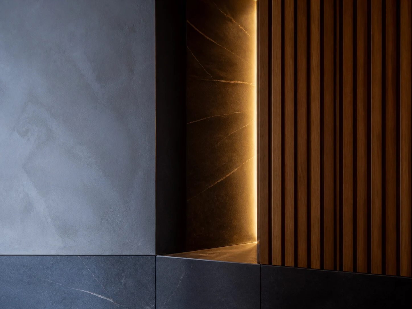
| Smooth plaster + deep vertical ribbing | Deliberate; clear hierarchy |
| Fine trowel texture + coarse stone | Layered, if the palette is narrow |
| Vertical slats + horizontal coursing | Conflicting direction |
| Two strong patterns, similar scale | Noise |
| Texture + strongly patterned wallpaper | Competing; neither wins |
Keeping the colour palette narrow across textures does a lot of work. Contrast in depth is legible and calm; contrast in both depth and colour and pattern at once is not.
Rule 4: light it or lose it
Texture is read through the shadows its relief casts. This is not a finishing touch — it decides whether the specification was worth anything.
- Grazing light, close to the wall and aimed along it, maximises shadow and makes relief legible.
- Flat frontal light erases it entirely.
- Daylight from a side window delivers the effect for part of the day and loses it for the rest.
Where two textured surfaces are lit differently, they will not read as a pair even if the materials are related. Decide the texture and the lighting together, or accept whichever the lighting gives you. Textured wall finishes covers how depth and viewing distance interact.
Rule 5: match relief to viewing distance
Fine grain disappears beyond arm’s length. Deep relief reads across a room. A combination that works on a sample board at 30 cm can collapse into two similar-looking flat surfaces at four metres.
Test the pairing at the distance the room will actually be seen from, under the intended lighting, before approving anything.
A workable process
- Decide which single surface is doing the talking, and why that one.
- Fix its extent architecturally — plane, wall face or structural line.
- Choose its relief depth for the real viewing distance.
- Confirm the lighting can graze it. If it cannot, change the lighting or the plan.
- Keep everything else quiet, in a narrow palette.
- Check the substrate can carry each finish — see the interior wall finishes guide.
- Approve from large samples, in situ, under the real lighting.
Step 4 is the one that gets skipped, and it is the one that decides whether anyone will ever see the texture you paid for. For the wider shortlist see feature wall materials compared.
Frequently asked questions
How many textures can one room take?
Two usually reads well and three needs discipline. The limit is not really the count but whether each has a reason to stop where it stops, and whether one of them is clearly dominant.
Can I put texture on more than one wall?
Yes, if the walls are related — two faces of the same volume, or a continuous surface turning a corner. Texturing opposite walls with different treatments usually makes the room read as unresolved rather than layered.
Do texture and pattern count as the same thing?
No, and mixing them is where rooms go wrong. Texture is relief you read through shadow; pattern is visual, read through contrast. A textured wall and a strongly patterned one in the same room compete for the same attention.
What about texture on the ceiling?
Ceilings are lit differently — usually from below or from fittings within them — so relief that reads on a wall may vanish or become harsh overhead. Test it under the actual lighting arrangement before committing.
Sources
- Building Envelope Design Guide — Whole Building Design Guide, National Institute of Building Sciences Accessed August 28, 2026.